
Maps have become ignored and deemed essentially useless in the United States. Once upon a time vacationers had “triptiks” – maps of the route you would take to get to Yosemite (or San Francisco or wherever). These types of maps or road atlases are what you consulted when you had to travel. For those people that did not have Triple A (American Automobile Association) access, they made do with detailed maps of entire states or regions.
These types of state and local maps could often be found at gas stations, sometimes for sale, sometimes for free. They were not designed for beauty or ease of use - ask anyone who tried to refold one - but they showed detailed road information you could use to plot a route. Surprise roadside attractions and side trips broke up long trips with surprises and sights.
These type of road maps and state maps are barely used at all now. Directions are now given and prompted turn by turn when you use Google or Apple maps or Waze. All these apps are owned by one company – giving the same directions. Meandering off the route to see the “mysterious shack - where gravity is upside down” or a state park just a mile down the road isn’t even a thought anymore. If it isn’t on Waze, you don’t visit.
This does not occur as the result of a harried traveler. Instead, the map apps don’t take “fun” into account. They will provide the quickest direction, and we all enjoy being rerouted around problems, but the surprise is gone and we often fear to ignore the voice because we might get lost.
The result is that most of the country has no use for maps or the information they provide any longer.
The Purpose of Maps
The primary purpose of maps is to illustrate the world around us and how we relate to that information. Take the evolution of the maps over time of Los Angeles as shown below.
These are four maps of Los Angeles over time. They highlight different things that were important to people at the time of publication. The maps are:
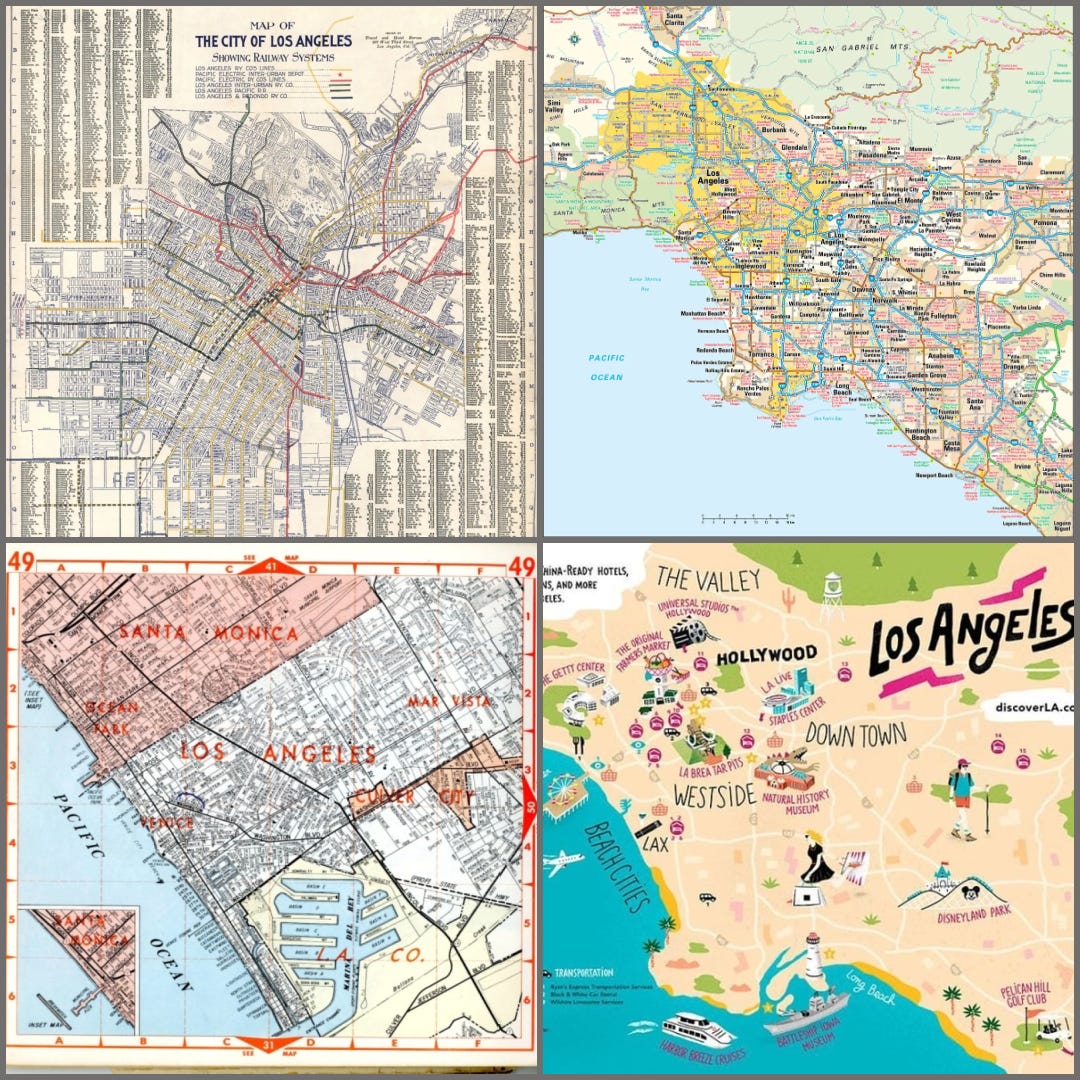
Upper left: Map from the 1930s showing Red Car Routes (electric street car). The Red Cars used to be the main method of travel for the majority of the citizens at this time, and a detailed view of where the Red Cars went was the critical information delivered.
Upper right: Map from mid-1980s showing the freeway system in the basin. This map is less detailed than the Red Car map. The freeway system was now the most important transportation system, used by millions. As the freeway system expanded and travel was made faster, people tended to commute longer distances. These maps made it easy to decide where you could live, work and play.
Lower left: Thomas Guide, book map of over 125 pages showing every street in Los Angeles. The Thomas Guide was essential in Los Angeles since the 1970s. It was a book of detailed maps of streets, freeways and some physical features. Without a Thomas Guide, finding an address for a party, friends, school, or work was hard work by trial and error. The purpose of this map was to give a level of detail otherwise unavailable. The London AtoZ offered a similar level of detail for London.
Lower right: A map designed to entice tourists to Los Angeles. This map is designed to display areas and items of interest for possible tourists. The ad uses the “map” of Los Angeles Basin that is familiar to people in outline, without going into the details of other maps. Since it was designed to entice tourists, the distance and smaller cities between attractions is disguised by font and placement on the map.
The first three maps display geographic details but are focused on giving spatial information which helps to navigate the city. That is (was) the main purpose of these maps.
There is a secondary purpose of maps, which can be created to support the achievements or goals of a certain group of users. Look at these maps below:

Upper left: (reprint) Map centered on Persia dividing the world into enemies, allies and unimportant places. Here, the Caspian Sea is show much larger than it is because Persia controlled most of it. Centered on ancient Persia, it shows Anatolia (present day Türkiye) and Greece smaller than they physically are. It downplays their place in the Persian world.
Upper right: (reprint) Ancient map from China. See that the map is centered on China and shows the coast lines of places Chinese sailors had traveled to. In this map China is the center of the world, just as Mercator maps show Europe as the center of the world. This map also has very good details on the coasts where Chinese ships had visited.
Lower left: This is a 1939 map showing which countries / territory that Nazi Germany has gained. This map was designed to motivate populations about the aggressive nature of the German government. A map created IN Germany at the time would show all Germany as one country, including these territories. This map, designed to sway opinions against Nazi German, show those territories that the German Nazi government had conquered.
Lower right: Map of the London Tube with destinations. It flattens out a complex display of subway lines into simple and easy to navigate form.
All of the maps above are designed to move people to action or to promote a sense of patriotism for the population. All of these illustrate the world as DEFINED by both the country of origin and time of creation.
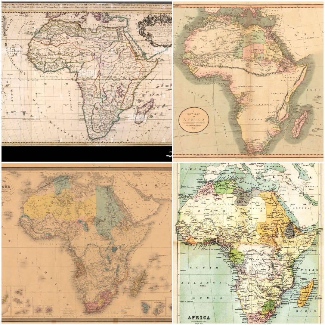
Evolution of Details
Maps evolve over time; usually as more detailed information is understood. Because we are “western” countries, this more detailed information is from our perspective. Look at the evolution of the map of Africa from the early 1700s to 1880.
New Uses
Map makers today are trying to create maps that provide information beyond simple geographic information. Let’s look at the different types of presented the same data, in this case election results from 2020. All of these present the same information in very different ways.

Upper left: Traditional method of showing election results by state. This is particularly useful in finding which states voted for which candidate – and how the results determined the election outcome. The drawback here is that the states’ population, and hence relative strength of the vote, is deceptive. For example North Dakota looks about as large as New York, even though New York has 10 times the voting power.
Upper right: This map shows a more detailed results on which COUNTY voted for which candidate. This is useful if you know the geographic and economic make up of states – where the big cities or rural farming communities are. If you don’t know a state well, the results seem deceiving. At the county level, Oregon looks very red. But the state delivered its votes to the “blue” party. This is because the blue in the upper left is where the three biggest cities in Oregon are concentrated: Portland, Eugene, and Salem. This region is the Willamette Valley where the population and economic centers of the state are found.
Lower left: The same vote total information as upper left, this time breaking the states apart to show the relative number of electoral votes. This map tries to show not just how each state voted, but the size of their populations and how that impacts the results. In this map, the red / blue states are shown with relative population size, trying to conform to the general geographic area information. None of the states look like this image, but the general outline is recognizable.
Lower right: A map of which state counties voted for whom – same as upper right. Only this time the population of each county is illustrated in population size, which distorts the map out of its geographic bounds. It is a useful map to some people, but is too busy for many others.
Future of Maps
Maps will continued to be useful in a variety of situations. They may have to change how they present some information, AND they will only be used if they provide the reader information in a way that is more successful than providing it otherwise. The complex map of Sudan very well displays the complex nature of the internal war for power.
It is in ways like this, that maps will change to provide unique information to readers.
